
But what really amuses me is that Ted is a Gratuitous Tilter. Roughly half of his pictures were taken at a 30º to 45º tilt. I have a feeling that he got that from me, but I'd like to think that I used it more sparingly. ;) Because the tilted pictures amused me so, I made a collage to share on Facebook and posted it with (what I thought was) a funny caption about alerting the authorities that D.C. was about to slide into the Potomac and wash out to sea. Once I made the collage it seemed pretty logical to go ahead and print it. And if I was going to go ahead and print it, I might as well print in a scrapbook friendly size. When I showed the print to him I prefaced it with "You can't have this one, I'm going to scrapbook it." he got all excited. No lie he said "My pictures are worthy enough to be scrapbooked?!" On the one hand, that made me feel really good! On the other, I felt an enormous pressure to follow through and actually do something with the pictures. And it's not a matter of worthy or unworthy...it's that I think that scrapbooking someone else's memory is REALLY HARD. I wasn't there. I don't know what your take away of the event was. I don't know what to say.
But the kid wanted the pictures scrapbooked and, by gum it!, I was going to make that happen for him. I'm not going to drag you through the (un)creative process, or tell you about the printer problems that took me about an hour to conquer. I'll say that my goal was to treat the pictures with dignity and respect. They are pictures that are tilted, and that makes me titter a little, but Ted loves history and was very impressed by the things he saw. WIth that in mind, I give you Washington D.C., a layout by Caroline with pictures by Ted:

Now you see why I'm not going to blather on about the creative process. :P
The font that I used for Washington is LainieDaySH. I think it matches the mood of the photos well, but in all honesty, it's too thin to easily cut from the Silhouette, so I had to modify it. I had decent success, so I thought I'd just throw up a couple of screenshots to walk through how I changed it to make it what you see here.

So this is the title, as typed into the Sil software. At this point I zoom in and double check that the letters flow nicely into one another. This font is pretty good, but I did notice the the n into the g wasn't connected to my liking.

To remedy this, I selected the word and clicked the "ungroup" button in the lower left hand corner (circled in blue). This changes the word "Washington" from one big file into a series of 'shapes' that can be treated differently. You could size or rotate each letter individually if you wanted, but today I just need to move them a little. Since I'm okay with the way the 'gton' flow into each other, I select all four letters and USE THE ARROW KEYS to scootch those letters closer to the 'n'. Why the caps? Because if you try to use your mouse or fingerpad invariably you'll cause those letters to move up or down. Using the arrow keys will prevent them from shifting in unintended directions.
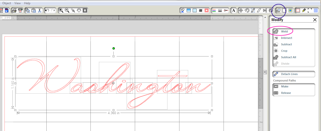
Once everything is lining up the way I want it, I select all the letters, and hit the weld button in the upper right hand corner (circled in blue). From here I click the 'weld' option from the submenu on the right side (circled in pink).
Next, I'm taking a critical look at the font itself. From my experience with the Silhouette, I know that cut is just too thin - the loop on the g might cut cleanly, but I'll never be able to get it off the mat without the cardstock tearing apart.
If only this font were a little fatter.
I could feed it a cheese danish.
Maybe if I put it on the sofa with a Real Housewives marathon on?
I know those options have both worked for me.
However, it might be slightly quicker to use the offset feature? Let's try it. ;)

To start the process, you click the offset button (upper right, circled in blue) to bring up the submenu. From there you click the offeset button (right, circled in pink). The default is .25 inches. That is too many cheese danishes worth! Yuck. We're going for cuttable and instead we turned into the doodlings of a love struck teenager. From here you can go into the "Offset Distance" box and just type in ".01" or whatever.
Let's try .01:


Okay! Now we've got a cuttable font! But...wait...that g is causing me some concerns:

I put the blue dot next to where the issue lies. The way that tail sort of jigs over is going to weaken that area - it's too close to where the g's descender meets the loop.
I'll be completely honest here. I did not notice this before I cut it. As it happened, I cut two versions of this. I cut one exactly as I've shown here, and another where I changed the offset to .02 (ever so slightly fatter than this one at .01) It wasn't until I peeled them off the mat that I realized there was a problem with the .01 version. As it happened, I liked the .02 version better. I'm not going to walk you through doing it, since it's pretty much exactly the same process, but here's the .01 and the .02 together:

Yes, the smaller version has more details, and that's a good thing for sure. But if those details are so tight that they don't cut well the whole thing falls apart pretty quickly. I cut them side by side because there wasn't a good enough reason not to. I'm glad I did, because looking at these on the screen leaves one impression, but the finished product gives an entirely different impression.
I hope that helps you look at your fonts differently. I've often ruled out gorgeous fonts because I've assumed they were too thin. Using the offset feature has allowed me to retain the look and mood of the fonts I love, while making them just chubby enough to cut effectively.
Thanks for stopping by! :)
No comments:
Post a Comment
Note: Only a member of this blog may post a comment.