Wednesday, January 27, 2010

A Smidge Too Late for January…


Go ahead, scroll down. I'll wait til you come back up.


Okay, so this is the project that I've been stewing on for a couple of weeks. I can't say that I've been "working" on it for that long, because truly the actual work time involved was maybe 6 or 7 hours, and that's from the (self-proclaimed) World's Slowest Scrapper. But back in December I found the base of this calendar at 2Peas, as well as the calendar rub-ons, both made by Maya Road. I wasn't certain what I wanted to do exactly but I knew the base would make a fun little calendar, and so into the shopping cart they went.


Shortly after these arrived on my doorstep (complete with a 25% off your next order! Coupon from 2Peas), the new Sugar Rush collection by Basic Grey was posted. Suddenly I had a slightly clearer vision of how I wanted the calendar to go: Fun, funky, ribbons, rub-ons, scallops… I gathered some paper, clicked "Buy Now" and then contemplated the nature of ugly gray naked chipboard. Yes. Something would have to be done with that.


Joann.com to the rescue! Glimmer Mist on sale at 30% off, free shipping on orders over $50 (excuse to buy the previously mentioned Ott-Lite): YAY! Funny thing was, the chipboard needed to be treated before anything else could be done. But once it arrived, Glimmer Misting is fast, but messy (work in an old box, and if possible line the box with papers so it doesn't seep through and ruin your work surface). It took maybe an hour to get all 6 chipboard bases dyed on both sides and another 2 or 3 hours to let them dry fully. This is my kind of project: do something and then take a two day long break.


Once the bases were dry things really started to roll along. I trimmed the paper to the size I wanted and corner rounded two corners and inked the edges. That took maybe an hour or so. No tedious brainwork. In fact, I purposely kept the thought at a minimum on this. With my colors chosen and supplies gathered, everything else was done without too much thought put into it. I knew if I started customizing things too much I'd get mired down, and most likely bored or frustrated and quit. Once the inking and rounding was done, another ½ hour or so was spent gluing the paper to the bases. For this, Scotch brand Wrinkle Free Glue Stick. It's less expensive, archival and perfectly suited to adhering larger cuts of paper without wrinkling.


The only part of the whole process was choosing the pictures. It took me about an hour or so to find pictures, resize them and order them online. I tried to keep them all vertical, because I knew that would fit better, but sometimes the shot that you want to use is horizontal, and you just have to deal. So I dealt. No biggie.


From there, it was only a matter of adhering the pictures, die cutting the scallop circles and rubbing on the calendar months (both done assembly line fashion) and adding some ribbon, jewels, a border die cut from bling cardstock or maybe a little rub on border)


And because the profile is so chunky and fun:


So, in recap:


Calendar base with acrylic flip easel: Maya Road
Dye for naked chipboard: Glimmer Mist
Patterned paper: Basic Grey
Calendar Rub-on: Maya Road
Cardstock for scalloped circles and various die cut borders: Bazzill Bling
Die cuts: QuicKutz nesting scalloped circles, scalloped border, dot border
Rub-on borders: Jenni Bowlin
Gems: Mark Richards
Inks: Staz On for edging pictures, ColorBox for papers
Various buttons and ribbons.
Oh! And teeny tiny staples courtesy of Tim holtz Tiny Attacher


Fun, fun, fun and guaranteed to on display and admired for one full year.

Tuesday, January 26, 2010

A little preview...


I've been "working" on this project for over a month now. Granted, most of the "working" has been acquiring materials. That's the easy part, when everything is optimism and good intentions. Then you get to the "doing" phase and suddenly that which was absolutely phenomenal in your head is a little shaky on (or "in") paper. But you forge ahead and trust that the vision will play itself out. Maybe not exactly as you dreamed, but perfect in its own right. We hope.

As of this writing, it's about half-way finished. I'm hoping to make more progress tomorrow night and maybe have pictures to share on Thursday.

Oh! And guess what?? This is probably the first thing I've made in EONS that hasn't used the Silhouette in any way, shape or form. On the one hand it feels kinda wrong, but it's nice to know I'm not totally addicted. Because I really don't have time in my schedule for 12 step programs.

Stay tuned!

Sunday, January 24, 2010

Here's the Proof:

I have long maintained that I am a slow scrapper. I have gone to three day crops, stayed up to the wee hours of the morning only to come home with three layouts. That I dislike. It's just the way I am. I have to stew on my choices. No hasty moves for me. Adhesive is to be taken seriously.

But here it is. The proof. Today, in the time it took me to cut 12 strips of patterned paper into 3 1/4" x 6 3/4" strips and corner round them, my daughter created the Earth, the moon, and an entire galaxy of stars.


(I'll share my project when it's closer to done. Or done. We'll see.)

Thursday, January 21, 2010

Two Things

Number 1

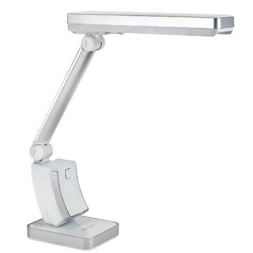
Man, I love my new OTT Lite!!


I happened to stumble across the deal of the century at joann.com, where this usually $79.99 lamp was on clearance for $19.99. There was also free shipping on orders over $50, and adding this to my cart conveniently saved me $6. Sadly, it's no longer available at JoAnn's (at least not at joann.com), but I was able to find one at Amazon. It's at $35, and there's a couple in black for $39. Still a good deal, if you ask me. The color of the light is wonderful. It sits at about eye level, but the slight shade keeps it from bugging my eyes but it doesn't seem to damped the light's spread. The result is actually being able to see, without straining my eyes or second guessing what colors I'm working with. It's so great not to be casting a shadow on my projects.
YAY for OTT-Lite, and YAY for great sales!!

Number 2

Thanks to the Ott-Lite I was able to actually take pictures of my most recent Circle Journal project. Before I would wait for daylight to get a decent shot, and even then I'd do a fair amount of fussing to get it just right. Granted, these shots aren't bound for Nat'l Geographic, but I took four shots, and I'm sharing three. And I'm not sharing the 4th because I realize there's a misspelling. Oops.


So this CJ has a "Sweet Treats" theme. I have to admit, this one stressed me out a bit. I don't consider myself very handy in the kitchen, and I knew when I heard the theme that I wanted use this recipe, but frankly, this recipe has a failure rate of about 85%. It's "Magic Marshmallow Crescent Puffs", and you bake the marshmallows, which are drenched in melted butter and rolled in cinnamon and sugar, in a crescent rolls, seal it tight and hope that the exploding marshmallow doesn't escape from the roll...and leak out everywhere. It still tastes great, but it's not exactly the kind of thing you want to take a picture of. And even if you did, no one would be inspired to try the recipe. Not pretty.

But the gods were on my side, and they actually came out yummy looking. I'd like to take credit for the photo, but I was in mini-freak-out mode about getting the puffs out of the tins without messing them up, and getting them drizzled "just so"...not that it really mattered, you can barely see it. As luck would have it, I know people who can use a camera and can be paid off with food.


Silhouette. There. You knew it was coming, everything I do has that thing somewhere. The size of this particular albums is TINY. Cute, but tiny. And I found that I needed more real estate, and my solution was to cut the file folder shape from the Sil, which allowed me to squeeze in a second picture (the bowl of marshmallows. i.e. the "before" shot. That one I took.) as well as the big journaling block about my mediocre cooking skillz.

The album is handmade, out of - can you believe it? - brown lunch bags. You decorate one side of the bag, and slide your recipe inside. Originally my recipe was on two cards, and worried about how the two cards would stay together, so I made the pocket. Jury's still out on the pocket. Frankly, I think it's cute, but it adds more bulk than I think this album can take. I ended up backing the two cards to each other. I think I may ditch the pocket...


So that's this month's CJ saga. I hand this off on Saturday and get the next one. (I hope!) I'm really having so much fun with this!

Tuesday, January 19, 2010

Circles

I think one of the neatest things about scrapbooking...well, after the shopping, buying, organizing and general fawning over products, is the wonderful sense of community that this hobby brings. There's a sense of camaraderie when you meet a fellow scrapbooker. That moment of "Oh, you're crazy too! We should get along just fine."


I find myself, for the first time in nine years, NOT working in a scrapbooking environment. This, for sure, has it's pluses, but I do miss (ever so slightly) the daily elbow-bumping of my fellow crazies.


Which makes me glad that prior to leaving the scrapbook store I set up a "circle journal" with my coworkers. This project is giving me that sense of community, the feeling of inclusion, and fills me with excitement.


If you're scratching your head and wondering what a circle journal is, relax, you're not alone. I only know about it because I was lucky enough to see journals being passed around, and I thought the idea was so intriguing it really stuck with me. A circle journal (or CJ) is an album that you create that has a theme. You create a page based on your theme, and then you pass the album onto the next person, who then creates her page addressing the same theme. Meanwhile, you've taken an album from someone else and you complete a layout based on that person's theme. Once you're finished you're going to pass it along to the same person you passed your first album to, and receive a new album from the same person who handed off to you before. Thus, the journals pass from person to person, making a circle once it gets handed back to its creator.

The albums are usually a smaller format, and generally have enough room for each participant to make a one or two page layout. The group of people involved can be people you know ahead of time, or may be people that you meet online through a message board, or if you're lucky you may be asked to round out someone else's CJ. It's best if you have 8 to 14 people. Too small a group will give you a book that's on the wimpy side, with probably not enough diversity. Too many, and you won't see your book returned to you for a year or more! Oh, that's another point, you have to decide upfront how long you have to create your entry before passing on to the next person. Our group chose a month, but everyone seems to leave it to the very last minute, so you could easily make the time frame shorter.

Themes for CJ can be anything your heart desires. Some themes in the CJ I'm in now are Sweet treats (a recipe album with a focus on sweets), Your favorite book, What makes your heart happy, spontaneous trips, holiday traditions, getting to know you... I've seen CJs with Pet Peeves, Hometowns, Shoes (thank God I don't have to create a layout based on my pathetic shoe "collection"), Music, Bucket List, etc., etc., etc. And it is always so fascinating to me to see these books. Not just the scrapbooking aspect - it's so fun to see every one's different styles, but I love seeing every one's responses to the themes. I find myself really wanting to read about someone else's hometown, and what drives everyone else crazy and what every hopes to accomplish before they die. Fascinating!


Whew. That was a long explanation! And yet, that's just the bare bones basics. We could talk for hours. Okay, maybe a half hour, but it would be a jam-packed half hour.


My little group of ladies started our journals in October, and I just completed my second one, not including my own. I'll share the one I just completed, but today I wanted to show the album I created.


This is my album. I used a Theresa Collins board book as my base. The book, as you buy it, is three tabbed pages, and I have a feeling these are meant to be kind of chapter separators, but I decided to make them my pages, and purchased several books. Because of the tremendous thickness of the book, I decided to limit my CJ to just one page per person. My theme is "Random Childhood Memories" and the title is cut from vinyl using my Silhouette. I love that the Silhouette software allows me to design in relationship - meaning I can create each word and position and size them independently so that they "go" perfectly with the other elements.


There are lots of ways to set up a CJ, and certainly there are no hard and fast rules. I wanted to create a place for each participant to sign in, answer a couple of questions pertaining to the topic, and (hopefully) add a picture of themselves. Space was an issue, so I decided to make these library pockets, also cut using the Silhouette (it's one of their designs). "Roll Call", the dots and every one's names are also cut on the Silhouette.


Just a close up of the pocket. You get a better look at the little questionnaire, which was created in Word. Nothing fancy. I'm not Word guru, so fancy isn't on the menu.


And lastly, this shot shows my intro/welcome page. It tells how I came to chose the topic, it asks them to fill out the card in the pocket and lets them know what I'm hoping they'll do.

Somehow I managed to send my book off into the wild without a picture of my page about my random childhood memories. You'll have to take my word for it: it was way cute, right down to the picture of me in one of my smocked Sunday dresses with the family's VW Bug in the background. It did not, however, follow the black, white and red theme I had for the intro section. I wanted to have a clear delineation of the business part of the book and the fun part of the book.

Okay, so that's today's monster post. I will grab some pictures of the layout I just did and post again soon. I would strongly encourage anyone even remotely interested in the idea of a circle journal to find a group that's forming and join in, or take the bull by the horns and start one yourself. Additional information such as theme suggestions and samples can be found here, here and here.

Saturday, January 9, 2010

The L Word


Love, folks, not lesbians. But I had to get the pop culture reference in for consistency's sake.

So I started this blog with the idea that it would be a way share my "creative pursuits", it would give me a forum for sharing the Silhouette love, maybe talk about the process a little. But my big mistake was thinking that I could start this in November. Even with the best of intentions, "creative pursuits" - much less writing about them - just aren't happening in December if you happen to work in retail.

So here I am, a month since my last very off-topic post, and it's time to whip this thing into shape.

Watch, I'll probably say that a month from now, too.

But even though I was busy, it wasn't like I didn't at least try to be creative. Granted, it only happened once, and it didn't get very far, but still: I'm giving myself credit for trying.

And more than that, I'm giving myself credit for finishing something, even if it's not what I started. See that picture up top? That started out as a Ho Ho Ho banner. One rare day off I decided that I could spend an afternoon and make a cute little banner. 97 interruptions later, I had the base cut and assembled. That's when I lost steam for the day and figured I'd finished some other day. Turns out that was the last day in December with any "me" time in it at all. So the pretty red, black and white banner bases sat on my scrap table, making me wish for time to myself, and thinking at the very least I'd have a jump on next year's holiday decorations. Needless to say, Christmas came and went, and the banner never got any more done.

As my first day off without obligations out the wazoo approached, I spent a lot of time daydreaming about what I might work on once I had some time. I had the sudden realization that Valentine's Day was coming, and wouldn't my pretty red, black and white banner bases look darling dressed up with pink and purple and glitter and bling and ribbon and buttons? Why yes, yes they would!

I love those drop-back-and-punt moments. This isn't what I planned for, but I still feel like I accomplished something pretty cool.

I wish I had a really great picture of the entire banner, but I don't. What I have is snippets of the final product, and maybe that's just enough to jump start an idea for someone else...