Wednesday, May 8, 2013

Reunited, and it feels so gooood ♫♪♫♫♪

There's a wretched little earworm to start your day. You're welcome.
Just kidding. That's awful. I'm sorry.

But seriously, I *finally* got to scrap yesterday and it was wonderful.  I have lots of weird free time, in that I've always done LOTS of homework at work between customers.  I am the queen of "using my time wisely", and now I don't have anything to do (between customers at work).  I suppose I could dust.  Or reorganize.  But instead, I brought in that scrapbook scrap project.  And I've been watching videos from 2Peasinabucket.  (My coworkers love that, I promise) The combined effect has left me ITCHING to scrap.  And finally all the stars aligned just right yesterday:


The picture is pretty crappy for sure.  But going to the Melt is sort of a rite of passage around here.  The kind of thing that deserves a scrapbook page.  And it is a fun, busy experience with stuff to look at everywhere.  Normally, I find that sort of decor in a restaurant schmaltzy and, at this point, tired.  But somehow when the Melt does it, it gets a pass - lots of Cleveland based artists have their work on the walls, plus old plexiglass from 80s era video games, and signs from old businesses is somehow more fun than the snowshoes tacked on the wall of every Max and Erma's, TGIFridays, etc.

But let's move away from the mini restaurant review that I am highly unqualified to give, and bring it back to the world of scrapbooking.  I said I've been watching videos.  I've also been spending my fair share of time on Pintrest.  This is very much inspired by:
and...


And there's a could of "Adventures of Glitter Girl" videos that probably inspired me as well, but nothing especially specific.  Other than Shimelle saying (paraphrased):"I don't look for embellishments that are theme specific, because there aren't really embellishments made for this.  So I basically match the mood and color of the layout."  That was very liberating for me, since I very frequently get hung up on needing embellishments to be - if not not literally connected to the theme, at least making some sort sense.  Guess what?  That's probably not going to exist for a layout about eating at a grilled cheese place.  But I think ultimately it's fun and colorful - and the same can be said for our trip to the Melt: it was fun and colorful.  And f#ing delicious.

I should also mention that recent Paperclipping Roundtable episodes on organization, hoarding, and patterned paper all contributed to this.  This layout was created entirely from scraps, which were so much easier to flip through after my reorganization efforts, and several guests saying, basically: "paper is easier to admire on a page than in your stash." -- just makes you want to dive in and use the stuff that you have instead of saying it's too precious to use.  (so guilty of that sometimes)

And if I were a guest on Paperclipping Roundtable, I would totally pick FridgeBinz as my pick of the week!

Friday, May 3, 2013

I totally lied.

I said that to a clerk last week when she asked for my phone number and I accidentally gave her my work number.  She laughed, which is good, because I don't normally declare myself a liar.  In my calc class in the fall there was a really adorable 17 year old girl who would occasionally ask a "dumb" question (no, it wasn't actually dumb, but if you're a little disoriented its easy to ask a question and then have that duh! moment) - anyway, she'd ask the "dumb" question, have the "duh" moment and then immediately say "Ha ha! Just kidding!"  I need to learn to say that.

So anyway, last we were here, I said "Check back next week, and I'll have something!"  Without actually looking, I'm not certain, but I may have said "for sure!"  Oops.  I don't have anything.

It was a WEEK.  I'm SO glad it's over, but it was much more hectic and demanding than I thought.  I had visions of walking away from my school work for a couple of hours on Sunday or Tuesday, but that didn't/couldn't happen.

The good news is: I actually have the WHOLE summer off! SOOOO happy about that.  And even in the fall, I'm only taking one class, and it's NOT an independent/directed study, so it's not going to be nearly as challenging.  So the rest of 2013 should be...

Uh. I'm not going to finish that sentence.  That just seems like a recipe for disaster!

At any rate, I am trying to get back in the swing of things.  But it's Friday, so I'm at work then over at the manfriend's until Monday evening.  However, I have a project that I've been thinking about lately.

Have you seen these?

This is part of the Fridge Binz line at Bed, Bath and Beyond.  The first time I saw these I immediately thought "screw the fridge, I want those for my scrap space."  So I kept my eyes peeled for a BBB coupon, and now I have two of these bins, which measure 7.75x13ish.  Up until now, my method for dealing with scraps from my 12x12 patterned paper and cardstock has been to throw them into a 13x15 archival box.  I do go to my scraps first A LOT, but it's sure a pain in the neck to find what I want.

So...enter the Fridge Binz.  I'm cutting my scraps down to 7.5x7.5 or 7.5xWhatever to fit in these.

Here's what my progress looks like today:

I thought I'd need two of these to fit all my scraps, but I can see now that I'll be fine with just using one for my patterned paper scraps -  heck, I may be able to squeeze in my cardstock scraps in there, too.  I'm holding on to the second one that I bought - that'll be perfect for all the 6x6 pads that I've accumulated through the years.  I think I'm going to scrounge for one more coupon and go back for the one that's 4 inches wide - that'll be perfect for the smallest of scraps.  I should just pitch them, but some of these scraps are like gold to me.  The "Mellow" line from Basic Grey? I still use that on my Octoberish pages.  Scenic Route? You can't make me throw that out!  I will hoard those scraps til the bitter end.

Plus, I feel assured that this is a good investment.  If for some reason I hate this method of storing my scraps, I think these will probably work in the fridge just fine. ;)

Tuesday, April 23, 2013

Dear Scrapbook Supplies...

I miss you.
♥Caroline

Obviously I didn't post a layout for the 15th of this month.  That's okay.  I love my ability to set priorities, and sometimes prioritizing some crafty time is important to my sanity, sometimes it is not.  

I've been observing in the classroom for the last three weeks (you know, in all that "free time" I have) and today and tomorrow I am teaching four classes.  It's all very exciting, and worth back burnering my Ugly Sketch Project for a couple of weeks.  But I just sat down at my desk - which is also my scrappy place - to prepare for tomorrow and wow! I *really* want to play.  I'm not going to. It'll have to wait until later...probably next week, in fact.  But I can't wait!

Life is good.  It feels so good to set a goal and then work to make it happen.

Stop by next week. Come hell or high water, I'll have something to post. YAY!

Wednesday, April 10, 2013

Stressed. Out.

Dear, sweet Baby Jesus, I could use a break. I'm tirrrrred.  Like, tired to the core. And here's the thing: I slept 8 hours last night.  And the night before. Which is a sure sign that I'm stressed out, cuz day'm! When I get stressed out there's nothing that I want more than a nap.

Well.  Cheese and beer are up there, too, but seriously - a nap would be the bomb.


That's me.  Yesterday.  Right before going in for my first day of teacher observations for my Methods in Teaching Field Studies class.  I'm really excited about this.  Excited in an "Wow! This is great! I'm getting so close to my goal!" annnnd...also....excited in an "Wow! This is positively terrifying!"

And as excited as I am, I'm also pretty panicked about it.  It's a lot of work, with worksheets and reflections, lesson plans and work samples and actually TEACHING 4 classes.

Now. I am not afraid of teaching.  I've taught at an expo with more people in each class than the biggest class I'm observing.  And I teach plenty at work now.  But there's a huge difference between teaching classes where your students are eager to be there and teaching classes where your students are obligated to be there by law.

But that's not all.  If that were the only thing on my plate, I'd be stressed.  Because that's what I do.  I worry.  But I channel that worry into preparation and then I kick major ass.  Sadly, there's only so much preparation I can I do for the rest of my life right now.  I came home from work on Monday night to find a "for sale" sign in the front yard.  I knew it was happening, and soon, but still it felt like being hit in the gut by a sturdy 12 year old boy.  It wasn't enough to put me down, but it still put a catch in my breath.

Today I found that I owe my insurance company $500 for a pair of glasses that I bought in the fall that aren't covered. Yay!

Jim texted me later to let me know that there will be showings tomorrow.  Yes. Because I wanted to come home from work and clean a house that I don't give a shit about.

I did Maggie's taxes today.  I don't know what Ruby Tuesday was thinking, but somehow they didn't take out enough and "she" owed $259.  Right. Because she has $259 to pay that.  And can get it to me before the 15th.  Guess who paid that?

And there's more. Lots more.  But not mine to share but it still affects me.  I just want it to be May, have both my classes done with and some kind of resolve about where I'm going to live come mid-June.  We're going to see a house on Sunday.  Should be interesting...

Next time I'll be happier. Or drunk. I'll let you know. ;)

Wednesday, April 3, 2013

Yesterday.

The past couple of days have been very weird. The manfriend worked over the weekend, so I stayed in Mentor.  (weird) The kids were at their dads, which isn't unusual for the weekend, but now that we don't have a dog, the house was super empty feeling and super quiet. (weird)  The kids are on spring break, so they stayed an extra couple of days with dad (weird), so on Monday Kerig and I were able to go out for dinner.  (weird for a Monday) More empty house when I got home (weird) and Tuesdays I have the house to myself until the kids get home from school, so most of the day wasn't much more quiet than usual (although, not letting the dog out twenty times a day is something I'm still getting used to).  I had to meet my study partner at Panera's to take an Abstract Algebra class (not 'weird' but definitely not normal), then I had to run errands.  Normal Tuesdays are laundry and Sam's Club, but they didn't happen.  It was odd not timing my errands to be home in time for the bus.  It was weird not making dinner for the kids, it was weird not taking Ted to his speed and agility workout.  It's not that I didn't have plenty of things to keep me busy, they just weren't the usual things that keep me busy.  I don't know if I've mentioned it here, but I'm a super routine oriented person, so I'm very thrown off at the moment.

I've mentioned that our current living arrangements are coming to an end.  In June the kids will move to Geneva to their Dad's girlfriends house.  I have until the end of June to find a place that's big enough for me, Kerig and the kids, feels safe enough for the kids, meets our weird quirks and fits our budget.  This is proving to be no easy task, and has come to be a major source of stress and anxiety for me.  Not only is the finding a new place stressful, but worrying about my kids, not being at all pleased at the new arrangements (this was not the plan that I agreed to back in the day, and I 100% do not think that what's being done is in their best interest) and then...there's the whole knowing how badly I'm going to miss them.  These past couple days alone have felt like foreshadowing of the future.  I'm not especially a people person, and I'm totally comfortable in my own company.  But that doesn't mean that I don't want my children around. I do.  It's going to take a lot to get used to...

But it's not all bad. I'm so excited to be able to move forward with Kerig.  Through all of this he has been so patient, understanding and supportive. I'm looking forward to a something smaller, cleaner and decorated more to my liking.    Now, if something would just land in my lap, that would the awesomest.

Anyway, last night I took a nice walk through the neighborhood and I was listening to The Paperclipping Roundtable, the show I was listening to was about scrapbooking everyday stuff.  This isn't foreign to me, I already believe in it.  My kids are 22,19, 14 and 12.  Our routines have morphed over the years. And I didn't scrapbook lunch or routines or daily life.  I wish I had a page or two that covered the really mundane aspects of life - you think that you'll always remember what a typical day was like, but after so many years and so many changes, the details fade away.

So even though yesterday was a totally weird day, it was a totally weird everyday day. It was no one's birthday, I didn't buy a new car, it wasn't the first day or school or the last, it was just a little more quiet with no laundry and fewer groceries.  So listening to this podcast, being encouraged to remember to capture the every day, I decided to scrap my day, with the three totally arbitrary and non-people-y shots that I had taken during the day.  They're not especially compelling photos - two were just quickie shots to communicate with Maggie (I had to mail her the battery charger that she had left at home and so I took a shot of the 15 people in line ahead of me at the post office) and then while I was out on my walk I kept seeing pinecones - this is also something I wanted to show Maggie, as we had gone "pinecone hunting" in October a couple of years ago and found nothing but old, rotting pinecones - turns out they drop in the spring...doh.

So here's what I ended up with:


If that looks familiar, I totally borrowed a number of elements from the "Molly" layout I just posted.  I used the same font for the title (SNF Lollihop), the same concept for the patterned paper at the top, and (as always) the same font for the journalling.  Note: I don't know if I've ever mentioned it, but I always use AvantGarde Bk BT - I've just found that keeping the font consistent is just another step towards simplifying the scrapbooking process, and to me, simplifying stuff like this makes scrapbooking less frustrating and therefore far more enjoyable.

I like that I used the Panera logo straight from my soda cup:

That four hours was a pretty huge chunk of my day, after all.  Plus I felt like it was a stroke of genius to run that through my CuttleBug to make a nice neat circle.  And I feel confident that the Tim Holtz Tiny Attacher staples will hold it in place.

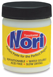
Oh! Speaking of holding stuff in place!  I happened on stuff a long time ago that I bought and then never used.  I finally broke it open a couple of weeks ago and I think I'm in love!


I got it at a local artist's supply store here, but you can get it at DickBlick.com, which is both fun to say and reputable and fairly priced.  I bought the smaller, less expensive bottle bottle, but if I knew then what I know now I'd happily have sprung for the jar.  And here's the deal: I'm not talking about quantity, because frankly I just don't craft enough to need any specialty adhesive in quantity.  What I am talking about though, is this stuff is super thick and you only need the tiniest bit.  I've been using it under all the Studio Calico wood veneers.  It holds like crazy.  I was trying to squeeze it out of the bottle directly onto the veneers, but I've since realized that it makes more sense to squeeze it directly only my fingertip, or put some on a scrap of paper, where I can then dip my finger in to grab a little and then "finger paint" it onto the piece that needs it.  I think the jar would just be so perfect - take off the lid and just dab your finger in.  I may spring for it just because - I'm worth it, after all.

Sunday, March 31, 2013

USP #7: Molly

Do you realize that we are one quarter the way through 2013 already??  Our weather has been monotonous at best, and rather January-like for the last three months, so it's hard to believe.  Maybe if spring weather would arrive in north east Ohio it would finally sink in that it's April already. All this means that I'm one quarter the way through the Ugly Sketch 1-15 Project.  I'm having so much fun with it.

And here's the April 1st entry:

I really like this one.  First, I absolutely love this picture of Molly.  So much so that I've been really paralyzed about scrapping it.  Does that happen to anyone else?  Those pictures that are just so ***** (insert: beautiful, special, one-of-kind, emotionally charged, etc) that everytime you go to scrap them you ***** (hit a creative wall/choke/make a really underwhelming layout) - and 9 times out of 10 I just give up and walk away. It's for that reason that I'm extra pleased with this.  Second, ...who needs a second with a first like that??

I've done a pretty good job at keeping my scrapbook shopping in check, but there have been a couple of things that been too big a temptation.  These little birds and this shamrock die from Ellen Hutson are a good example of said temptation. I know it seems silly that I buy these dies, when I can do the exact same thing on the Cameo, but (LOOKOUT: MASSIVE JUSTIFICATION AHEAD) I find that dies are a lovely way to use up scraps.  Yeah. That's the ticket! Scrap useage!

That's only half true.  The whole truth is: wafer thin dies are a great way to use scraps and I'm ever so slightly addicted to buying them because I think they're so flipping adorable I can't stop myself, they hop into my shopping cart and enter my mastercard number practically all by themselves.  Tricky bastards, they are.

Oh! And remember this? I mentioned that I had just used SNF Lollihop, and that's the font that I cut "Molly" from.  I really dig it.  And I'm really certain I got it for free somewhere along the way...I think I'm just too cheap to shell out for a font...even $4.  However, I'm now going to use the heck out of it because now I know it has a $4 street value. ☺

That about wraps up my blathering for the April 1st entry.  Which means now it's time to reveal (LOL, that word is a little drama-laden for this application) the sketch that I'll be working on for April 15th:

There she is. She looks a little square here.  However, I'm still gonna be an 8.5x11 scrapper.  I just need to work on drawing rectangles. :P  The little window-y thingy is for four Instagram shots. For once, I actually do have pictures in mind.  And can I just say? Dear Instagram, I ♥ you.  You make scrapbooking so much more fun for me.

Thursday, March 28, 2013

Lost in the Shuffle


I scrolled down through the blog a couple of days ago and saw a sneak peek of two layouts that never got posted.  They were originally created for Cord Scrapbook Studio, but I don't think they ever got posted.


I had been given the Enchanted line from Authentique.  It's meant to be a Halloween line, but I thought that it had a sort of rock'n'roll edge.  So I decided to use it on this layout about Maggie and I going to see Mike Doughty at the Beachland Ballroom.  The layout is loosely based on Page Maps sketch:

I said loosely. And I meant it.
Here's the other layout that I made that never got used:


This is using the Pink Paisley "Portfolio" line.  And it's based on the Page Map sketch:

That's a little less "loose."

I loved the day that Kerig and I took a ride on the choo choo.  Truth be told, the train ride was a little bit of a let down, but walking around taking pictures - and even taking pictures ON the train was fun.  The volunteer conductor kept giving me looks, but when we talked he was more trying to figure out my gear.  Fair enough.

Alrighty then.  Not much to add there.  I'm actually staying in Mentor this weekend.  I have a metric shit ton of homework to do, but I hope to sneak in an hour or two of fun time.  I still have my USP to photograph, and thay'll be up on Monday for sure.

Thanks for stopping by!  Hope you and yours have a Happy Easter or a lovely Passover.

Tuesday, March 26, 2013

Total Copy Cat

Wow.  There's a throwback.  When was the last time you thought of the phrase "copy cat."  It's been a while for me, but there it is.

At any rate...  One of the things that catches my eye on Pinterest (aside from colorful alcoholic drinks and incredibly rich food)(and I don't even really drink alcohol...) is font compilations. And every time I see one that I like, my decision to repin is based on its Silhouetteworthiness.  Stop looking at me like that.  Like I'm the first blogger to make up a word. Puh-lease.


So I decided to make my own. :)  And these are 100% Silhouetteworthy.

1. gentle redhead
2. mouth breather
3. SNF Lollihop (Oops.  This one is actually $4.  That's pretty close to free, right??)
4. Chickabiddies
5. LaurenScript
6. Bebas Neue
7. Flowerchild
8. Heartbreaker
9. Intrepid
10. CluffHmkBold

So, a couple of notes. Most of these are super easy for the Silhouette, they're generally thick enough to work with easily.  Intrepid is the thinnest, and I use that  for negative space, like in a tag.  Chickabiddies is just a dingbat font, but they're such cute faces.  I don't know why, but the girl I used in the poster is my mathgrrrl alter-ego. I just used the SNF Lollihop today.  I love it.  It welded together really well after a little scootching around.  Did you know that you can ungroup a word and move around each individual letter? You can, and that's VERY useful to know!

And: Impact.  I use Impact. A. Lot. And I don't care that it's obvious.  I didn't put it on the list because it's obvious, but it's not just obvious...it's classic.

Last note: The link for Bebas Neue?  Has the word 'penultimate' - which is one of my most favorite words.  Don't look at me like that.  Like I'm the first blogger to admit to having favorite words. AND, it has "The spirit is willing but the flesh is weak" which is the most awesometastic quote that my mother used on me two weeks before sending me off to an all girls college school, imploring me not to be a lesbian.  (Not that there's anything wrong with that.) Thanks, Mom.

So that's that! Thanks for stopping by!  I'll have an USP up on the 1st...it's already done and everything...I just need to photograph it.  Hope to see you then.

Thursday, March 21, 2013

Hi. My fingers are inky.

Hi. It's nice to see you.  :)


So a couple of weeks ago I was creeping around Pinterest and came across a "I figured out how to cut my own handwriting on my Cameo" pin.  Now, I've done that the hard way - write something with a sharpie, scan it in, go into photoshop and bump up the contrast, blah blah blah.  So I thought I had figured it alllllll out. And then a couple of days later I actually READ the pinner's post (doh!) and they were using their iPad.  Huh. Well.  I don't have one of those and I ain't gettin' one of those! Harumph. I got a little pissy, I'll admit.  

But then I was all like "So?  That doesn't mean there isn't a way for me to do it, too!" I mean, that lady figured out what worked for her, I just needed to figure out what works for me.  So I poked around the Google Play store and found Sketchpad Pro for Tablets, which works on my Kindle Fire.  I'm not going to say that the program is free (it's not: $4.99) or super intuitive, but it's manageable on both fronts.  I've been practicing getting the hang of writing and doodling with my stylus and yesterday I doodled the รผber creative hi talk bubble you see above.  I know. Don't hate. The genius, it just comes to me.  

Oh shut up.  I know it's basic, and verging on overdone. And I could have saved $4.00 and purchased something similar from the Silhouette store.  But that's not the point. I'm making this stuff my bi....uh, I'm really mastering the technology.  That's the ticket!  

And I do have a real sense of accomplishment, because it's not quite as easy as I thought it was.  There's a little cleaning up to be done, so manipulation of edit points.  And it is rough.  But I like that. 

So yeah. Anyway.  Big deal.  I doodled something and cut it out.  Now what?  Well, I have that kid who probably wouldn't mind some mail, right?  So I made a card:


It's...uh...messy. And there's no real purpose to any of the stuff on there.  And I don't care. :)  And since it'll have a $20 bill in there, neither will she.  

Thanks for stopping by!  See you soon!

Friday, March 15, 2013

Ugly Sketch 1-15: Skyline Chili

Welcome to the 6th installment of what has become my own personal sanity project.  After a fairly relaxing start to the year - from an obligation/school standpoint at least - things have begun to ramp up a bit.  I'm taking an abstract algebra class as an independent study - not the easiest stuff to wrap my brain around, but so far I haven't been overwhelmed at the amount of work to do for it.  This past week I started my last education class (Methods of Teaching Pk-12) as an 8 week online class.  As is always the case, the condensed nature of online classes makes the pace hectic, at best.  But it's a cool class and I'm learning a lot that I'll be able to put to use, so I'm really happy to be doing the work.

This project has made more tuned into the first and fifteenth of the month - I can feel them approaching and I keep the sketch in mind on my commute and in the shower - those precious moments where I get to chose my thoughts.  So I had a vague notion that I was going to do a layout about Skyline chili, but I got sick and was in high gear for school.  Next thing I know it's the 14th and I'm wondering if I can make it happen.  

Obviously, I squeezed it in:

I had an Archiver's coupon and dragged Kerig into the store last Saturday.  I had a wee little shopping spree. Like, the Hambly transparency paper, the patterned 6x6 paper, all the Studio Calico wood veneers (omg, my biggest weakness these days), some of the washi tape and the brads.  Hey, at least I used the stuff.  I'm pretty good at buying stuff and deciding that it's so special that I have to save it for something really important.  I have not yet determined what constitues "important" in paper crafting.  

I was also a semi-bed girl and bought some dies at SimonSaysStamp.  These little, teeny, tiny little hearts said they really wanted to live with me.  And so did the sentiment strips.  And in the name of full disclosure, so did these little text bubbles (but I didn't use these here).  

Old and new here - that manila name/year thing is old - I have no idea where it came from.  But that metal "k"? Holy cow.  That's circa 2003 or 2004 from when Making Memories pushed embellishments into high gear. 

So there she is.  Yay me.  I'm not Monday morning quarterbacking this one. I like it. 

Here's the sketch that I'll be using for April 1st:

You know, if you ever feel like playing along, I'd love to have you and see what you do.  Leave a link in the comments.  It would make me super happy. :)

Thanks for stopping by!  Have an awesome St. Patrick's Day! 

Tuesday, March 5, 2013

Call me...maybe

subtitled: my dalliances with crack.

I slept way more than usual on Sunday.  Apparently, I stored up some extra energy that needed to be expelled. Today.

Ian had truck problems yesterday, and he asked me to take him to work this morning.  At 6:30. Whew.  I'm not a big fan of the 6:30.  When I got home I laid in bed and scrolled through Pinterest until my left hand fell asleep.  I got up, showered and went to Sam's Club.  $300 later, I came home, put everything away, started on the laundry and made some egg salad.  I had some lunch, made a little decoration for my cell phone case and then did my taxes.  When it came time to print my copies I decided the time had come to hook up my new wireless laser printer. [Can I just tell you? I don't know why I waited so long! We print a ton of stuff for school, most of it black and white, and yet I'm shelling out tons of money on color ink cartridges.  What a racket that is!  So long, Epson, I'll hit you up when I need color prints, till then pfffft!]  More laundry, more printer installation (the kid's computer), more food prep, more laundry, dinner, took Ted to his speed and agility workout, helped Molly with her homework, goofed off, picked Ted up, stopped at Dairy Queen for buy-one-get-one-for-99¢ Blizzards, came home and...PLAYED.

While I was poking around on Pinterest this morning I started searching for Silhouette boards to follow.  There were a bunch of tutorials for using the trace tool.  I know how to use it, I just haven't ever felt the urge to. But it got me thinking: what am I missing? What amazing things are there that I'm not tracing?? I decided to type "png" into the google machine and click on the images tab. Lots of stuff came up but nothing that really screamed "TRACE ME!"  Well, not until I got to the android dude.  He screamed "TRACE ME! LOVE ME!" because he is, indeed, perfectly traceable and perfectly lovable.  And you know what? He'd make a cool "call me" card.  So I made a little speech bubble and voilร :


I'll send it to Maggie.  Of course "kids these days" don't bother checking their mailboxes, so she'll get it sometime in May.  :P

I'm starting to feel it though.  I think it's time to veg out to a little Watch What Happens Live and then head to bed.  Thanks for stopping by!

Friday, March 1, 2013

Ugly Sketch 1-15:5 Happy March!

March isn't my favorite month, but any month that features the beginning of spring, has a holiday centered around drinking beer and features the color green prominently is a-ok by me.  I live in Cleveland, so I don't kid myself that we're done with snow or that spring will show up anywhere other than on the calendar. But, you know, we'll baby step our way away from the worst, most scary part of the year and soon enough we'll find ourselves inching our way towards the best, most lovely months of the year.  So: Hello, March! I'm happy to see you!

But on to the bidness at hand, yo.

Remember this?
This was my launching off point for my layout this time around.  And here's what it ended up being:


Once again, I'm looking at the jpg version a couple days after completing the layout having a total "Monday morning quarterback" moment - I wish I had done this, this and this differently.  I suppose I wouldn't change that much, but I would definitely bulk up the layering at the top of the zig-zag strip more.  And I think that was my original intent.  I must have seen something shiny and forgotten to add those extra two layers that I had in my mind.  Oh well.

I used to be a better journaler.  I didn't understand why people had such a hard time with it.  These same people who said "I can't journal" would sit next to you and tell you all about their pictures, pointing, getting animated, clearly excited by the stories they had to tell about them.  And yet here I am, with crappy, surface-y journaling.  But if you sat next to me on the sofa, I'd probably start his curiosity about my cameras, but I would probably mention how much it means to me that this kid comes and sits with me for 15 or 20 minutes at time, telling me about his day, asking questions, telling me about what happened in history or what the coach said at speed and agility, or asks me about my day...or even just hangs out quietly.  At the end of the day, when I've thrown in the towel on studying, when the kitchen is cleaned up and the laundry is folded, I'll head up into my bedroom, put my feet up, poke around the internet and put on whichever Real Housewives show is on that night.  Bedtime for Ted and Molly is at 9 o'clock (still - why they don't protest this, I don't know...), and somewhere around 8:40 Ted will come in and flop on my bed so that he can see my computer and the t.v. and make fun of the Housewives (fair enough) or talk to me about whatever I'm looking at.  I think it's cool that Ted likes to tinker - and frankly I should do a page on all the things he's fixed around here, or how I know he'll be a great dad and his yard will always be impeccable - but to me, the story that I want to tell, that maybe I'm afraid of jinxing (hell, I'm tearing up just writing about it here) is how much I love this kid and how much his daily visits are the highlight of my days.

And there's one other thing.

Those hands. Ted is 14.  He shaves. He's taller than I am.  He lifts weights and has muscles.  His body is turning into a man's, and it's strange and awesome to see.  But those hands - they still look like a boy's hands.  There's something still round and soft and childlike about them.  And I don't know why, but that makes me tear up a little, too.  I just want to pop the plastic off the front of the clock and put my finger on the second hand to make it stop.  Now.  Right now.  This is where I want to stop time and just have these kids, like this, right now, forever.  This is a good place.  And those pudgy little fingers are the reminder.  They are the last vestige of his childhood.

Ok.  I have to move on.  Seriously, I'm at work, bawling about Ted's fat fingers and how he's growing up.  I must look like a psycho nut job to my boss.  :P

And here's the sketch for next time:

Once again, I don't have pictures or a theme/topic in mind, although I suppose my sub conscience is suggesting this be some kind of lovey-dovey relationship kind of page.  We'll see.


Thanks for stopping by.  It should be interesting how the next couple of weeks pan out - I start another class on Thursday so I'm assuming my work load is going to quadruple. :P  But come hell or high water, I'll have a layout up on the 15th.  I like this forced break too much back-burner it, even (especially) when I'm busy.

See you soon(ish)!


Friday, February 15, 2013

Ugly Sketch 1-15: 4 Winter

I feel tremendous pressure to have a catchy first line with all the spelling, grammar and punctuation correct.  You see, this first line (as well as the first image) gets posted on my Facebook timeline as soon as I hit the "Publish" button.  While the rest of the post can fade away in anonymity, that first line (and image) might actually get seen.  That's a lot of pressure.

At any rate, it's the 15th of the month and I've got my Ugly Sketch layout to share:


It's funny how looking at the jpg version of these adds a new perspective.  This is true to the sketch, yes, but seeing it now, I'd like to have something to ground the three journaling blobs.  Or maybe just moving that bottom one up would help.  Hmmm.  

And here's the original sketch for comparison:
I'll be honest. This is an awful sketch. You don't have to be a really great scrapbooker to see that. But it's a start, right?  I'm sort of impressed with how well the actual layout turned out in spite of the sketch. 

And yet, still...those arrows still bug me.


Here's the sketch for March 1st:
I think this sketch has better bones.  :)

I used a stylus that we sell for drawing this - made it SO much easier to control.  Trying to do this with just my chubby finger made me question my fine motor skills.  This isn't exactly high art here, but at least it wasn't as frustrating as last month's was.

That border isn't supposed to be crooked, but I like it.  Expect to see that tilt exaggerated in the actual layout.


Last night Ted (my 14 year old) found out I have a blog.  It's not that I was hiding it, but I usually work on it late at night or occasionally from work between customers.  So he was scrolling through quickly, and asked with the most sincere incredulity "Mom, you wrote all that?!" and when I nodded yes he said laughingly "You're such a nerd!"  I love my kids. :P

So in the interest of staying wordy and nerdy, I have one more thing to add today.


Same layout, taken with two different cameras. The reason I'm putting them side by side and showing them to you is I wanted to talk a minute about barrel distortion.  The picture on the left was taken with a Nikon P7000, which is a top of the line point and shoot camera.  It retailed for $500.  It's my "pocket" camera - although nothing I own has pockets big enough for it, it's only a pocket camera when compared to my D7000.  And honestly, I love this camera.  The color in the left hand picture is actually truer than the colors in the picture on the right.  But what I wanted to point out was the way the picture on the left bows out in the middle.  It the photography world, that's referred to as barrel distortion, and you can see why - the sheet of cardstock here has a distinct whiskey barrel shape to it.  The distortion exists in most non-telephoto lenses, to some degree or another, at some focal lengths.  In more 'real world' shooting instances you'd have a harder time noticing it, but trying to take pictures of something that is very straight and rectangular - it's hard to hide that imperfection.  But look at the picture on the right.  I'm at work today, and I threw my P7000 in my bag to take this picture here (my store has really beautiful natural light), but I just couldn't get the layout to flatten out in Photoshop.  So I decided to reshoot it with one of the store's cameras.  I picked up the D600 because it has the Tamron 24-70 lens on it.  To be honest, I'm not in love with the D600 - it has one feature that just makes me batty.  But I am in love with the Tamron 24-70 lens, and this shot shows why.  Look at how straight those edges are!  Both shots are straight out of the camera with the exception of levels correction (to correct the exposure) and cropped in as you see here - but no attempt was made to 'fix' the barrel distortion on either.  I think that the one on the right is fantastic.

And here's an interesting tidbit. I have no idea how these images look to you (dear reader) color-wise. I just calibrated my monitor less than a week ago.  (That's a lie. My personal IT and manfriend calibrated it less than a week ago, while performing many magic tricks that healed my computer of several deadly diseases)  As I sit here and look at the images above, I'm not overly impressed with the color on either.  The one on the right appears to be too blue, the one on the left appears too green.  In both cases I did a custom white balance reading before taking the pictures - I'm kind of a stickler about that.  So that neither color is what I think it should be - that's very disappointing to me.  I turned my computer so that my fellow coworker (and fellow camera nerd) and explained my findings to her. She responded with "I think the one on the right is truer to the real life colors."  When I adjusted my monitor for her viewing angle she said "Oh, yeah, now I see the blue green difference!"  But when I turned it back and changed the angle for me, I put it at yet a different angle, wherein the one  on the right looked amazingly accurate. This digital stuff is tricky!

BTW, that Tamron 24-70 f/2.8 lens?  A bargain at $1200.  

Thursday, February 14, 2013

love u.

Have you noticed? Today is Valentine's Day.  It's everywhere.  Love and hearts and pink and red and flowers and chocolate and all things romance.

I'm not with m'honey today.  He's sort of busy today. :)  And that's a good thing.  But I did mail him a card - which is CRAZY, because I am horrible about actually putting things in the mail. But I digress.

It's simple.  It's guy friendly. It's graphic. 


I love the scripty love word.  Love.


And the inside? I like that.  I made it - which isn't rocket science or anything.  But I'm not super creative, so the idea of putting those words with the arrow and welding together feels like whoa, I'm a design genius. :P  Not really, but I like to pretend.

And now, I have to dash.  It's Ian's (my oldest) birthday, and dinner is just about ready.  Thanks for stopping by.  Check back in the next day or two for the ugly sketch layout.

Laters!

Sunday, February 10, 2013

Music Videos...against my better judgement

Maggie asked for a mix CD for Christmas.  I can't adequately express how cool it is to have a teenager say that they like your offbeat taste in music so much that they want it (period) or enough to make it a Christmas gift. The one I made for her is my favorite ever (that I've made) and it went over very well - Maggie really liked it, too, which of course made me very happy.

In honor of the Grammy's tonight I'm going to share as many of the videos here as I can.  I haven't watched them all.  This maybe a bad idea.  But I have seen some, and they're catchy, funny, well made...so we'll hope for the best on the others.

Disclaimer: This is a mix made for a 19 year old.  There's some inappropriate language...namely a bunch of f-bombs.  Oops.  Turn back now if that offends.


Skylar Grey: C'mon Let Me Ride


Sam and the Womp: Bom Bom 


Macklemore & Ryan Lewis: Thrift Shop


The Avett Brothers: Kick Drum Heart


Philip Philips: Home


Mumford and Sons: I Will Wait


Macklemore & Ryan Lewis: Same Love


The White Stripes: My Doorbell


Stephen Lynch: Beelz


Chrisette Michele: Best of Me


Imagine Dragons: It's Time


Flo Rida: I Cry


Pop Danthology 2012


Passion Pit: Take a Walk


Edward Sharpe & The Magnetic Zeros: Home

This isn't the exact order.  And boy, I do believe that matters.  But alas, &%$# iTunes jumbled up as soon as I burned it.  Goofy iTunes.  At any rate,  I hope you heard a song or two you liked.  Or at the very least,  you don't think less of me for my goofy taste in music that might have some naughty language in it. 

Thanks for stopping by.  It's the 10th, so I'll have an ugly sketch-inspired layout for you at the end of the week.  Laters!

Friday, February 1, 2013

What I see


There she is.  Ugly Sketch 1-15: 2-1. This isn't my favorite so far.  I think there's something about doing layouts about men that requires that you reign it in, no frou-frou, colors have to be muted, embellishments kept to a minimum.  I think that part of my issue here is what you don't see - we were shooting at Squire's Castle and we were up to our knees in snow.  So for a solid hour I was dinking around with white background paper, light blue patterned paper, snow flakes...and none of that looked right with the picture.  For the second hour, I got sucked into watching The Unite States of Tara on Netflix, so solving the pressing what-paper-to-use dilemma faded off into the distance.  Eventually I snapped to and came up with the combo you see here.  The weird misting on the bottom is my nod to the wintry mix you don't see in the picture.  The next dilemma was the title.  I had already set myself on "What I see" but for some reason I was stuck on cursive.  And not just a handwriting type script, but scroll-y and flowing and formal.  Yeah. That did not work. I finally occurred to me that I needed to bring it down a notch.  I need to find some good, but casual handwriting cursive fonts.  And then I need a way to organize them, so I'm not wasting so much time looking for what I've got in mind.  If you have suggestions for that, or want to point me in the direction of a blog post or pin that could help me with that, by all means, leave me a comment.

Boy. These things just keep getting uglier and uglier. Yikes.

The thought here is that the three squares are Instagram shots.  The rectangles are corresponding journalling boxes, and the arrows are way to connect which picture goes with which box.

I might need to look into a way of making these a little less ugly and a little more accurate at conveying what I'm thinking.  But to be honest, this is meant to be quick and dirty, I'm not looking for a book deal, just something that keeps me scrapping a little here and there.


Looks like I'll see you in a couple of weeks.
Unless I manage to do something share worthy before then.  I've kind of got a hankering to do a mustard stain t-shirt...haven't been able to shake that thought. Maybe one of these days...

Monday, January 28, 2013

Looking outside.

I'm having a hard time lately. January has been one long, unwelcome emoticoaster ride. And I want off.  I've had some highs, but mostly I've had some low-low lows.

But here's the one thing that you can count on: when you look outside yourself and do something nice for someone else, it boosts you.  There's no denying - making someone else smile makes you smile.  Scheming to make someone smile puts a spring in your step for days.

Maggie is off at school. Valentine's Day is coming, and it seems the proper thing to do is to send off a little package full of love.  As luck would have it, Maggie sent me a text last week saying "Um, can you send me the spare car key?" Perfect! Now I have a deadline and an excuse.  I'd already begun gathering the supplies, but it's no fun saying "I'm sending you a surprise package, so check your  mailbox."  (Problem with kids these days is that they don't get snail mail, so there's no reason to check their mailboxes.)  So yay! "I'm sending the key, but also a pair of socks and gloves that you left here" - perfect upgrade from envelope-with-key to an actual package.

I made a mobile out of cardstock.  There's no good picture of it, because it was flipping impossible.  But, here's a little show and tell, maybe it'll make sense.
This is the ring that everything hangs from.  It's just two concentric circles with holes in it for the string to tie into.   If you look closely one of those circles is an oval.  Here's why.  I cut out six of these circles and used spray adhesive to stack them together.  When you do this, paper becomes very stiff and stable - perfect for bearing a little weight.  The oval is so that when I stack them all together I can line it up properly and get it exact.


From there I cut loads and loads of hearts and keys and "I♥u"s and "love" words from red, black, white and pink. The keys, i♥u and love were all at the bottoms of the mobile.  I cut them a bunch of times each and stacked them with spray adhesive so make them good and strong.  I tied the string around them and then layered hearts up the strings in randomly and tied the other end of the string onto the mobile's ring.  From there, I added some string to the top for hanging.  To be honest, that was the only hard part - I'm not certain I tied it perfectly straight, so it hangs a wee bit wonky, but it's okay.


So there's the best shot I could get, complete with the cheesy late 80's wallpaper that's in my scraproom.  Don't hate.  ;)

The string is from a massive thing of baker's twine I got from Crate and Barrel years ago.  It's going to last me a hundred years. Bonus: it cost $8.99.  Random craft score there!


It's become a fun tradition for the kids to find a little Valentine treat on the morning of the 14th.  I absolutely adore the fun Valentine's things at Target.  So I usually pick up some tumblers or bowls to fill with candy.  Maggie won't be here this year, so her cup had to be mummified in plastic wrap to hold everything in place.  Down at the bottom there's a big Hershey's Kiss, then it's layered with holiday M&Ms, Hershey's hearts, kisses and conversation hearts, topped with more kisses.  And a big box of Red Hots and a bag of Twizzlers Pull'n'Peels, just for good measure.  I sincerely hope this candy lasts for a long time, otherwise I'll have to send her new jeans to celebrate St. Patty's Day.


All I know is this: as crappy as my week was, making that mobile and packing up these treats and standing in line at the post office made me HAPPY.  And getting a "YOU ROCK" text today along with a picture of the mobile hanging in her dorm - perfect bliss.

Monday, January 14, 2013

Ugly Sketch 1-15 Project: 2


So pleased to have stuck with it.  Yes, I realize I did a layout, it's not like I'm dieting and exercising or even pinching pennies any more than usual.  So to say "I've stuck with it" elicits an eye roll even from me.  But it's winter and I feel blaaaaah, and sometimes on my day off I just want to stay in bed all day and even something as enjoyable as cutting and pasting cardstock is more than I want to do.

The photos on this are "3x5" - which are actually 3.5x5.  On an 8.5x11 layout, that means that the areas to the right of the top photo and to the left of the bottom photo are exactly 3.5 square.  I thought that would be kind of cool, because there are tons of square shapes in the Silhouette store.  At least I thought.  And of the ones that I found, some weren't theme appropriate and some wouldn't have cut right when sized that small.  So instead of having a huge selection like I thought, I had maybe 10 or so to chose from.  I'm not in love with the combination that I have here -- I've used the leaf one before and loved it, but the chunkiness of it juxtaposed with the more delicate fishtail lace - if just doesn't feel like it jives to me.  And in retrospect I might have cut that fishtail lace in one of two other colors and used the negative pieces to fill a couple of random holes on this, just to make it a little more modern and funky feeling.

I do love the title though, which is straight from the Silhouette store with no alterations except sizing it down to fit my needs.  It's funky and fresh and very Molly who declares way-too-many-things as being "awesome."  I also like that I was able to use the awesome word in the journaling - I think it lends a little cohesion to the page.

Not quite where I stand on the bird, which actually has a thematic tie in to the day (although, it's not mentioned or seen on the page at all), but the beak gets lost on the picture and it seems a little "out there."  But I'm not fussing with it at this point, just doing the 'what-if' post mortem, which is probably better suited to exams and hands of euchre and not scrapbook pages.

The only other take-away that I have is that I wasn't (am not) fond of the way the photos are positioned here.  It took a fair amount of will power to stick to the essence of the sketch.  And it's a sketch, it's not like I have to be literal about it, but by the same token, if I monkey with it too much I'm not doing what I set out to do - which is to save time and emotional effort in the layout process.  I'm just trying to eliminate one set of choices so as to make the scrapbooking process less cumbersome.

Here's the sketch I'll be cursing for February 1st:


My intention is to use a panoramic-y sort of picture on the page.  Do I have a panoramic-y picture in mind?  Nope.  Heck, I'm not even certain I have a picture that's suited to that kind of crop.  But we'll see.  And I'll wrestle it into submission one way or the other.

Thanks for stopping by.

Saturday, January 12, 2013

Buffalo Chicken Dip

No. This is NOT going to turn into a a recipe blog.

Last year I stumbled on this recipe for Buffalo Chicken Dip that was amazing.  It's a feat of simplicity and yet horribly addicting.  I bookmarked it. I pinned it. I revisited it several times.

And then it was gone.

**POOF**

And I'm not going to lie.  It sort of caused me to panic. I spent a couple of hours searching other recipes and every one just seemed a little off.  As luck would have it, the manfriend had a print out of the recipe on his fridge from last year.

Let's hear it for pack rats! ☺

And since the original link has vanished, I'm just going to put it in here, where I know it'll be safe. I hope.


Ingredients:
8 oz. package of cream cheese, softened
1/2 cup ranch dressing
1/2 cup Frank's Red Hot
1/2 cup shredded mozzarella
2 to 3 whole chicken breast

Directions:
Boil chicken; cool; shred
Heat oven to 350ยบ
In baking dish, stir cream cheese til smooth.
Mix in ranch dressing, Frank's and cheese.
Stir in Chicken
Bake 20 minutes.

Stir and serve with bagel chips, pretzel chips, celery...whatever strikes your fancy.

ETA: So far I've made this with frozen chicken tenders (cooked and shredded), canned chicken and today I made it with a rotisserie chicken.  By far, I prefer the chicken tenders or rotisserie chicken over the canned chicken.  The rotisserie chicken was easier, but it's hard to resist the lure of eating the skin, which is pretty awful for you.  I doubled the recipe and used two full chickens today and that's just too much meat.  So I think if you're going to use a rotisserie chicken, maybe use 3/4 of the white meat...and maybe up the ranch and mozzarella to make the texture just right.  But as far as "mistakes" go, this is still pretty darned tasty!